A logo is an element of corporate identity, the most frequently registered form of a trademark. It consists of a symbol, illustration, and/or graphic printing. Often the logo is confused with the company emblem. The main thing to remember is that a logo is a word written (traced, drawn) in a signature style.
The logo is a very important visual and compact image of the company. A correctly developed logo will always attract and retain customers, creating a positive impression and a peculiar aura around the business. And having done a lot of work while promoting your product, you will want the potential customers to stay on your site for as long as possible, and a well-executed logo is the first thing that catches their eye.
In our everyday life, we constantly see logos on almost any product (food, cars, etc.), you can find the manufacturer’s logo on any packaging. Unique logos of print media make publications distinguishable from the rest.
Classification of Logos
Logos vary depending on the visual elements used, compositional features, selected fonts, etc. Here we list the most common types of logos:
- Text
- Symbol (graphic);
- Combined (text-graphic).
- Emblem.
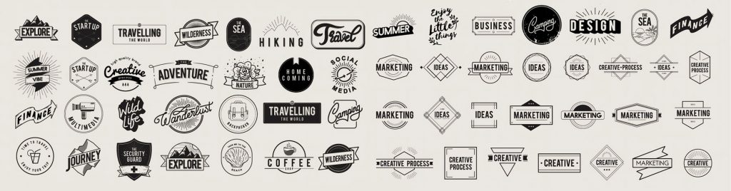
Text logos are made by writing the name of the company (product, trademark) with the selected typeface. Depending on the type of typeface used, this group can be divided into two subgroups: classic and decorative. Classic fonts include serif fonts (Times New Roman, Courier) and sans-serif (Arial, Pragmatica).
Logos of this type are very simple and usually tedious. Many well-known companies have opted for text logos. However, to create an original and really high-quality logo you will have to spend a lot of effort. It is necessary to work out all the subtleties and details: shade, shadow, etc. Text logos or logos that are not particularly noticeable in visual perception are usually distinguished by frequent advertising and/or high-quality products (Sony, Panasonic). For such companies, quality and reliability work for the logo, and not vice versa.
Symbol logos are obtained by creating the original symbol (sign). For new companies, opting for a symbolic logo can be complicated because they do not have much brand recognition. When you decide to create a graphic or symbolic logo for your business, make sure that the image you choose is recognizable and memorable. The advantage of this type is that it is easily perceived and perfectly helps to create subconscious associations with a particular process or object.

Combined logos consist of text and a graphic element. This is the most common type of logo, as the use of a graphic element in the logo makes it more memorable and allows you to make a long company name visually more attractive and distinctive. In addition, the icon part of the logo is perfect as a “mark” on the goods (products) of the company. As a rule, the sign is either located above or precedes the accompanying word. It is recognized that the combination of character and text is better remembered.
Emblems are text-graphic logos that characterize both the owner’s activities and their attitude to the subject of activity, a conditional image of the idea, a short story about the subject of marketing.
The Process of Logo Creation
Let’s take a look at logo creation splitting the process into four indicative stages of logo design:
- preparation, collection of information, information processing
- concept development
- making changes to the concept
- introduction
At the preparatory stage, the creators of the logo determine what exactly will be included in the logo. Perhaps, some features of the company, of the target audience, or of the goods and services that the company provides. Try to respond to questions such as: how would you describe your company in 1-2 sentences? What are your company’s long-term goals?
What keywords can describe your business? What is the value of your products and services? What is your target audience? What qualities should your logo bring to your customers?
At the second stage, the development of the logo concept begins. This is when it is determined whether the logo will contain the name of the company, or it will be a symbol, or a combination of a picture and the name of the company. Several concepts can be developed at once, and then you select one option.
At the third stage, changes are made to the logo concept. It also happens that from the third stage of logo development, the creators have to return to the first or second stage. Logo design is indeed a complex process that requires time and effort. In addition, the customer may not like it. So you need to start all over again.
It is necessary to formulate the main mission of the logo. Its shape, color, and content should reflect a certain meaning. A logo with a strong idea is well received by customers and better remembered. It should also cause an association with a product or company activity. An externally attractive and high-quality logo will be able to arouse customer confidence and admiration for the company. It is necessary to study the interests and needs of the target audience of the company. Given the results of the analysis, it is necessary to advantageously reflect the company features in the logo using fonts, colors, and icons.
If you have successfully completed the third stage, then you can proceed to the logo introduction. Before you draw a logo on letterheads, business cards, think about how exactly you will promote it on the market. Always remember that this is not a picture but a tool of your advertising campaign, your brand, the face of the company.
Most Important Logo Features
It often happens that, making maximum efforts, making our product or service of high quality, we do not get full value. Trying to understand what the popularity of our company depends on, we start digging deeper, but the answer very often lies on the surface – without a good, memorable logo, it is extremely difficult to count on success.
Style and catchiness. Quite often, specialists think it’s a brilliant idea to create a logo that looks just ultramodern. However, such a logo becomes outdated very quickly, and its design has to be improved from time to time. It is advisable to change the created logo only if there is a need for it. Besides, once seeing the logo, people should think: “I already saw it!”. That is, a successful combination of the visual series and the inscription helps a person to further recognize the logo.
Uniqueness and Simplicity. Very often, companies take some design elements from the existing logos of other companies. But still, do not forget to observe ethical standards and look for individuality! Remember that almost all well-made logos are simple and clear. The expression “less is better” is very suitable here. The simpler the logo, the easier it is to remember. The logo overloaded with details loses to simple ones. If the brand has an original name that is consonant with the activities of the company, it should be included in the logo. But if the name is difficult to pronounce, long and inaccurate in meaning, it is better not to include it in the logo.
Attractiveness and Associativity. Your logo should be so attractive that even those who have not used the services of your company pay attention to it. Try to test the attractiveness of your logo design by conducting a survey of potential customers. Or do a focus group. So you can find out what impression your logo creates, what they think about it, and what emotions it evokes. The visual component of the logo, its font and color should cause exclusively relevant associations and create the correct and accurate image that matches the general theme of the logo as a whole.
Good readability and informational content. The main thing is that people understand the design of your logo. Otherwise, it is simply ineffective. You most probably have seen and (don’t) remember logos that, despite the external originality, were practically unreadable or the meaning of the text was misleading. Do not make people decrypt texts in the logo. Users start browsing the page from left to right and the first thing they pay attention to is the upper left corner of the header, in which the logo is usually located. If a visitor, having first opened a resource and looking at a brand name, immediately understands where it is, this is a plus for the site.
Creativity. This implies the presence of some zest, hidden meaning or message in the logo. If a person sees this highlight, they will surely appreciate it and remember your logo.
Your logo is the face of your company. It should be original, easy to remember, and appropriate to your business or activity. Use your creativity and do not be afraid to embody the most daring ideas — and your logo will actively work on the popularization of your business!