
A well-thought-out, clear, memorable and representative logo is often a crucial element to the brand or trademark success. A good logo has to catch the eye, sink into a heart and stay there producing slightly noticeable warm vibes. Yeah, like any other symbol, it shouldn’t be too suggestive or aggressive, but it also has to be distinctive enough so you would never confuse it with another logo or another brand.
There are many cult logos that may seem unbelievably simple but increasingly effective and hard-to-remember. Just think of Mercedes-Benz’s logotype or about the signature MacBook Apple mark that never fails to remind us about the high status and quality of the product! And the legendary Nike Swoosh logo (yeah, it even has its official name) is one of the most recognizable brand logos in the world and it is worth 26 million dollars! Of course, we don’t mean that the logo alone will be sold regardless of the product. But a good one is very important to the creation of a brand image and once it becomes cult, it will become your best partner and the most convincing marketer.
Of course, all these examples are not strictly related to our current topic because those are examples of well-established brand logos that already have a well-established reputation. Nevertheless, they and many other highly successful samples of brand logos may serve as a great inspiration for you once you are planning to master the complex but fun art of logo design. So let’s start right now from some valuable theory before we get down to practice!
What Makes a Great Logo, After All?
Like we mentioned in the beginning, a good logo has a number of objectives to fulfill and it has to do it once at a time without becoming too overloaded by symbols and letters. Now let’s talk about some key points that constitute a really great brand mark.
- Easy to remember. Even if you are starting a brand that sells extra-luxury goods “not for all” and you practically do not need any kind of wide-range coverage when you advertise it, your logo is still very important and has to be easy to remember. Why? Well, let’s face it – at least because people love remembering things and recognizing them once they see them again! And the higher your ambitions are regarding the distribution of your goods and services, the simpler they have to be, which is always a great challenge for you!
- Represents the identity and the ideology of the brand. Yeah, you might consider that the complex identity and ideology is not one of the primary things to think about when you are creating a brand logo. A great concept with recognizable shapes and catchy colors would be enough and the main goal is to differ from competitors. Well, it won’t work this way! In a long time perspective, your logo will become an integral part of every promo and every product it will be placed on so it has to go hand-in-hand with the major idea that you are going to broadcast. Gathering a focus group will be a great idea to test your logo before implementing it. Ask the people about the feelings and the associations that the logo brings to life in their minds to find out if it says what you intend to say. Even if you don’t have a budget for a focus group, you can ask your friends or colleagues.
- Convincing but not annoying. Of course, the logo has to be noticeable and eye-catching. However, the chase for the people’s attention may as well lead to the opposite. Never forget that there are also plenty of other semantic dimensions that the good logo should be reminding you about. A good logo should also describe the brand as trustworthy, qualitative, friendly and simply visually attractive.
- It should be original. Yeah, a good logo always requires meticulous market research because you also have to stand out of all the other logos it may happen to interfere with. It would be very sad if you invest lots of effort into designing it and then people will mistake it for another brand. Or even worse – for its low-quality double that intends to acquire the share of the market by stealing some other brand’s identity.
Getting Down to Business
The following set of 10 tutorials describes how to make different kinds of logos and mostly dealing with typical cases. They are hardly to be called fundamental, however, there are many ways you can benefit from them. Firstly, they are mostly short, so it is easier to find time for watching and practicing. Secondly, each of these tutorials is dedicated to the production and design of a certain style of logos so you can pick the once that you like the most, or the once that will help you to create the logo for your brand by yourself. Most of the videos don’t require deep knowledge of Photoshop or Adobe Illustrator and even when they do, a step-by-step explanation given by the professional designers will help you to go through all the processes. After all, they are just fun to watch and logo-crafting may become a great creative pastime!
1. Creating a gradient logo from scratch

Gradient logos normally feature simple shapes and mostly rely on the smart use of color ramps. They are pretty trendy and widely used in the IT industry, image editors and many other products and services. This video will give you most of the basics in just 16:19.
2. Pattern-based face logo
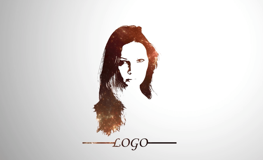
From this short video you will learn how to make an impressive logo based on your own or your friend’s photo. In just 6:35, the professional designer will explain all the details so you can easily make one for yourself. A logo like this may become a great new avatar for your social media or whatever you want it to become! Be creative and don’t mind the bollocks!
3. Single Weight Line Logo

If you prefer minimalism in art and branding, this video is for you! Want to make a minimalistic but exquisite logotype for your brand by yourself? Well, it is even simpler than you thought before! In just 10:41, you can learn the basics and then give your imagination some creative freedom! The logo is made in Adobe Illustrator, so don’t forget to install it if you want to make one for yourself.
4. Minimalistic Logo Featuring Brand Name and Pattern

This tutorial will teach you all the basics of a brand name-oriented logotype design in just 12:52. The great thing about these types of logos that they are pretty universal and can be used for a wide array of brands. This will require some photoshop skills, a little bit of patience and, of course, as much creativity as you can find!
5. Gradient Logo With 3D Effect

If you already mastered all the nuances of gradient logo design from the first video, you can go even further, adding some cool 3D effects to your brand mark. This video will explain all the basic details and tricks in just 7:36. And don’t forget to make sure that you have an Adobe Illustrator installed before you get down to business.
6. 3D Voluminous Text Logo

Just look at this super cool gradient 3D logo featuring this giant letter! However, you can make a whole brand name out of letters like this if you want. Well, we’ve got no limitations except for those which we set ourselves! So launch your Adobe Illustrator and turn your imagination to eleven! The video lasts only 12:55.
7. Origami-style Logo With Brand Name
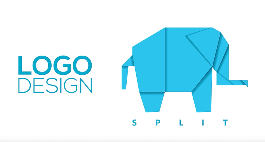
If you have some spare time, we highly recommend watching this terrific video that will explain the simple tricks behind the design of this cool blue origami elephant. If you’re in love with the geometry or you want to make an emphasis on the strictness and punctuality of your brand ideology, you may benefit from this well-narrated 15:34-long tutorial.
8. Minimalistic Bicolor Logo

This impressive minimalistic logo looks both stylish and respectable. It features some simple shapes that, however, are meticulously planned and well-considered by a skilled graphic designer. You can discover all the secrets behind this terrific Spartan Helmet logo in the video that lasts just 17:55. All the design is performed in Adobe Illustrator.
9. Vintage-style Logo with Brand Name
In case if your brand is all about old traditions, granny’s recipes and essential materials, then it deserves a logo that will fully represent all those features. From this 13:41-long video, you will be able to discover all the secrets of restrained, old-fashioned logo design. So let’s do it – less matley images and figures, more titles, trademark details and, of course, a brand name written with the help of retro fonts. Looks really trustworthy and aristocratic!
9. Gradient 3D Letter Logo
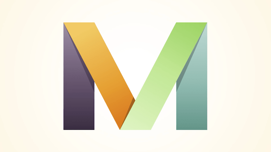
If we’ve already been dealing with gradient logos and volumetric giant letters, why we can’t unite these terrific experiences? This 7:22-long tutorial will teach you to make a beautiful letter that may feature the primary brand colors as well. Some extra shades will make your logo look modern and high-tech.