Everything we see has its own color, which can have a certain influence on a person. Some colors can make us feel nostalgic while others cheer us up. Sometimes when you surf through the websites, you don’t even realize that the colors have such an influence on your mood. There is even a special field of knowledge called color psychology which studies this unconscious effect that colors have on human behavior.
In fact, colors have different meanings that may vary according to gender, locality, and other aspects. So if we talk about front-end design, it must be chosen thoroughly, as it’s one of the main marketing tools that help to make a sale.
It goes without saying that correct code and algorithms are highly important for a website, but we shouldn’t forget about the proper use of colors, as they can make your page memorable, attractive, and therefore profitable. Remember, you never get a second chance to make a first impression, so use it wisely.
Color is the best tool for conveying any message you want. It helps visitors understand the concept and aim of the website and influences their comprehension of the content. The website consists of many parts, including a search bar, logo, text, menu, navigation, etc., so the right color must be chosen for each section.
An interesting fact is that marketing and branding specialists understand the hidden power of color and widely use it for attracting potential customers and making sales. They thoroughly pick the color that conveys the necessary meaning and create the right impression in the customer’s mind.
Useful Tips and Tricks
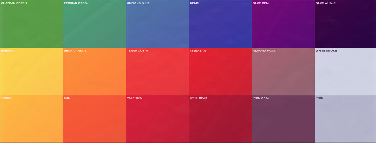
- Find a primary color that will dominate on the website. This one color should be used in all the sections here and there, for example, for buttons and borders. It may be a dark color or hex value picked from a color scheme. In this case, such resources as AdobeColor and ColorSpace will come in handy. You can also find a nice color for your brand logo there.
- Add other colors. If you have been working in this field for quite a while, you should know the “60-30-10 rule,” which implies that you choose the main color that takes 60% of the canvas, a secondary color that covers approximately 30% and leave the rest 10% for the third color. So, basically, you should pick at least three colors that look great together.
- Consider using some other colors too. When you have the basic color scheme for your website, you may want to add a couple more of them. For example, different shades of the main colors can be used for headings, buttons, sidebars, and other sections. We all know that interesting and eye-catchy design with vivid colors improves the user experience and retention.
- Double-check everything. As soon as you finish working with color, make sure you double or even triple check the website. Sometimes, it really helps and you get valuable insights. So you may notice a poorly matching color in one of the sections or a color that doesn’t suit the purposes of the project. Always recheck your work in order to eliminate all the weak sides.